See you on the flip-side
One year when I was bored, I had a fit of creative energy that needed to take the form of graphic design. So I decided to create logos that would be identical if you flipped them over 180 degrees.
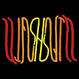
WASHBURN.
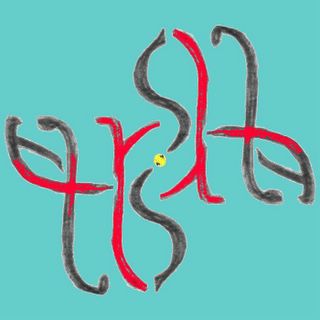
TRISHA.
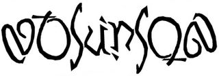
ATKINSON.
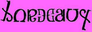
BORDEAUX.

DOWLING.
And, of course:
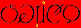
SERICO. If I ever open a chain of high-end
Italian restaurants, this will be my logo.


4 comments:
Nice work on the Italian one.
(Sounds like something that someone might have said to my prom date.)
Either that or, "My dear NofeMob! Thank you for kicking me in the face repeatedly with the profundity of your intellectual analysis. That and your size-10 Timberland. Nine times."
And you'd reply: "GENTLEMEN! ..."
Hey, those are pretty neat. I recently created one for myself. It is for a logo blog I just started called "Logo by Logo." My logo says "logo" both ways. Check out my site to see it.
There is no correct response to this. These must have consumed more free time/brainpower than I can ever imagine needing to be wasted.
That said, bravo!
Post a Comment